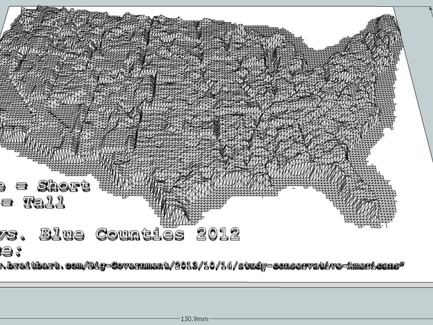
2012 USA Red vs. Blue County Demographic 2d to 3d Conversion
thingiverse
Another 3d demographic map. I find that the 3d representation makes the data a bit more useful in terms of perception. Especially, when you step through the rendered layers and can see which areas drop out as the print height increases. But hey, it could just be old age. :-) Have a great day, Bill.
Download Model from thingiverse
With this file you will be able to print 2012 USA Red vs. Blue County Demographic 2d to 3d Conversion with your 3D printer. Click on the button and save the file on your computer to work, edit or customize your design. You can also find more 3D designs for printers on 2012 USA Red vs. Blue County Demographic 2d to 3d Conversion.