Font Swatches Tested & Ranked
thingiverse
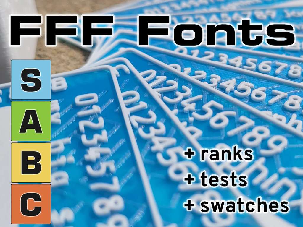
The project images show how each font printed at 0.4 mm. The great news is that the best five I have found are all open-source and totally free! _note [my entry on prusaprinters](https://www.prusaprinters.org/prints/71231-font-swatches-tested-ranked) has MUCH better quality images & tables_ ## Small 3D Font Tier List | | Font | Free | Quality Notes | |:----:|:------------:|:----:|------------------------------------------------| | **S** | [Osifont](https://github.com/hikikomori82/osifont) | ✓ | purpose-built for CAD (ISO 3098) | |<td colspan=4> | | **S** | [Overpass](https://overpassfont.org/) | ✓ | my fav; stylized & very readable at small size | |<td colspan=4>| | **A** | [Varela Round](https://fonts.google.com/specimen/Varela+Round) | ✓ | simple & great | |<td colspan=4>| | **A** | [Ubuntu](https://design.ubuntu.com/font/) | ✓ | modern with a bit of style | |<td colspan=4>| | **A** | [Orbitron](https://fonts.google.com/specimen/Orbitron) | ✓ | great Eurostile alt | |<td colspan=4>| | **B** | [OCR-B](https://en.wikipedia.org/wiki/OCR-B) | ✗ | better than OCR-A | |<td colspan=4>| | **B** | [Comic Sans](https://en.wikipedia.org/wiki/Comic_Sans) | ✗ | wacky MS default | |<td colspan=4>| | **B** | [Futura](https://en.wikipedia.org/wiki/Futura_(typeface)) | ✗ | some characters not connected | |<td colspan=4>| | **C** | [Univers](https://en.wikipedia.org/wiki/Univers) | ✗ | great bold variant, normal is too thin | |<td colspan=4>| | **C** | [Montserrat](https://fonts.google.com/specimen/Montserrat) | ✓ | much worse than expected | |<td colspan=4>| | **C** | [DIN](https://en.wikipedia.org/wiki/DIN_1451) | ✗ | bad; loses fidelity with ½ of characters | |<td colspan=4>| | **F** | [Quicksand](https://fonts.google.com/specimen/Quicksand) | ✓ | non-manifold shapes! | |<td colspan=4>| ## Minimum Print Size & Scale Size in this table is a factor of the primary stem weight. Think of it as a uniform thickness of the “l” character. If you were switching between fonts this keeps a uniform lineweight. Size isn't correct for some programs (like blender) that don't seem to use baseline height correctly. This lookup table may be useful: _pt, mm, and blender size are for absolute 0.6mm linewidth_ please update me | Tier | Font | pt | mm | Blender Size | Relative EM Scale | |:-----:|:------------:|:-----:|:----:|:------------:|:-----------------:| | **S** | Osifont | 23.68 | 8.36 | 14.055 | 1.0000 | | **S** | Overpass | 16.38 | 5.78 | 7.240 | 0.6916 | | **A** | Varela Round | 18.75 | 6.62 | 8.670 | 0.7916 | | **A** | Ubuntu | 18.23 | 6.44 | 7.430 | 0.7700 | | **A** | Orbitron | 20.69 | 7.3 | 9.110 | 0.8732 | | **B** | OCR-B | 16.50 | 5.82 | 6.310 | 0.6962 | | **B** | Comic Sans | 17.68 | 6.24 | 8.870 | 0.7467 | | **B** | Futura | 21.26 | 7.5 | 8.530 | 0.8976 | | **C** | Univers | 23.68 | 8.36 | 7.540 | 1.0000 | | **C** | Montserrat | 23.68 | 8.36 | 11.000 | 1.0000 | | **C** | DIN | 23.68 | 8.36 | 9.630 | 1.0000 | For example in a normal program Osifont at 36pt would be nearly equivalent to Comic Sans `26pt. 36 * 0.7467 ≈ 26`.  ## Factors Considered * Wall Thickness. I've found the minimum wall thickness for text to be about 1.5x the nozzle diameter. The smallest I typically design is for 0.6 mm font line (stem) width which looks okay on 0.4 mm nozzles and sharp on 0.25 mm nozzles. * Letter spacing. This is really the equivalent of wall thickness for negative text. * MInimum resolvable details. Things like the dot in the “i” character. * Round terminators. Sharp edges are going to get rounded by your slicer anyway. * Positive vs Negative. All these fonts printed nicely in negative, but quality in positive varied a lot. ## Why these fonts? If you search these fonts are commonly suggested around the web for FDM or FFF printing. There are of course other good fonts, but many if not all do not have an [open font license](https://en.wikipedia.org/wiki/SIL_Open_Font_License) and are therefore encumbered by various companies. If you have a suggestion for another let me know in the comments! ### Note on Quicksand I came across this font after I saw it suggested and it looks great in inkscape but if you render it with a 3d program you can see it has loops and shapes that result in non-manifold objects so just DO NOT USE this one.  ## Design I used the [10print](https://10print.org/) texture in some places. This was created in python, exported to SVG, then wrapped around my object in blender. If people are interested I can post a gist. ## Printing The files are designed to be printed with a 0.4 mm nozzle or smaller. The .3mf file has the color changes built-in. I did spaghettify the swatch stand once so I recommend printing with a brim (also in the .3mf). If you want to print the swatches similar to the photos then insert a pause at 0.4 mm and 0.50 mm to switch colors.
With this file you will be able to print Font Swatches Tested & Ranked with your 3D printer. Click on the button and save the file on your computer to work, edit or customize your design. You can also find more 3D designs for printers on Font Swatches Tested & Ranked.